개발을 진행하다가 화면 위에 팝업과 이미지를 띄어야 하는 상황이 있었다.
css의 position이 계속 헷갈려 정리 한다.
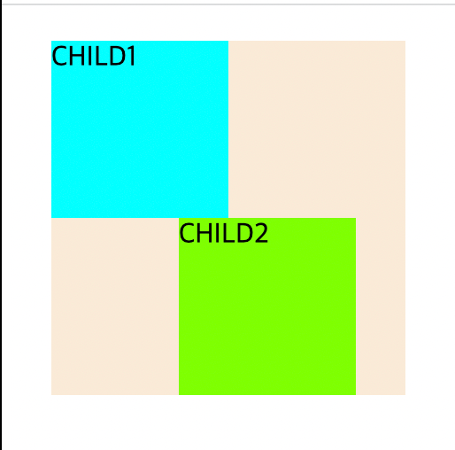
1. Position 속성
| 타입 | 의미 |
| static | 가장 위, 왼쪽으로 배치됨 (top, left, bottom, right 값 전부 무시) |
| relative | 요소 자기 자신을 기준으로 배치 |
| absolute | 부모(조상) 요소를 기준으로 상대적 배치 |
| fixed | 뷰포트의 초기 컨테이닝 블록 기준으로 배치 |
| sticky | 스크롤 영역 기준으로 배치 |
자세한 내용은 아래 소스와 결과를 보며 이해하자.
Position 적용 예시
position.html
<!DOCTYPE html>
<html>
    <head>
        <link href="style.css" rel="stylesheet">
    </head>

    <body>
        <div class="aa">
            <div class="a">CHILD1</div>
            <div class="b">CHILD2</div>
        </div>
    </body>
</html>
style.css
.aa {
    width: 200px;
    height: 200px;
    margin: 20px;
    background-color: antiquewhite;
}

.a {
    width: 100px;
    height: 100px;
    background-color: aqua;
}

.b {
    width: 100px;
    height: 100px;
    background-color: chartreuse;
}
결과

position: static (default)
style.css
.aa {
    width: 200px;
    height: 200px;
    margin: 20px;
    background-color: antiquewhite;
}

.a {
    width: 100px;
    height: 100px;
    background-color: aqua;
}

.b {
    top: 50px;
    left: 50px;
    width: 100px;
    height: 100px;
    background-color: chartreuse;
}
결과
: b 에 top, left를 적용하였으나 무시됨을 확인
position: relative
style.css
.aa {
    width: 200px;
    height: 200px;
    margin: 20px;
    background-color: antiquewhite;
}

.a {
    width: 100px;
    height: 100px;
    background-color: aqua;
}

.b {
    position: relative;
    top: 50px;
    left: 50px;
    width: 100px;
    height: 100px;
    background-color: chartreuse;
}
결과
기존(position: static)에 적용이 안되었던 top, left가 적용된 것을 확인할 수 있다.
b 박스를 보면 원래 있어야할 위치 기준으로 위 / 왼쪽에서 50px 움직여 그려진 것을 확인할 수 있다.
position: absolute
해당 아이템이 담겨있는 박스 기준으로 위치값이 변경된다.
부모 요소가 relative인 요소를 찾아서 계속 위로 이동하는데, 부모 요소 중 relative가 없다면 브라우저의 좌측상단 0,0을 기준으로 위치 값이 변경된다.
style.css
.aa {
width: 200px;
height: 200px;
margin: 20px;
background-color: antiquewhite;
}
.a {
width: 100px;
height: 100px;
background-color: aqua;
}
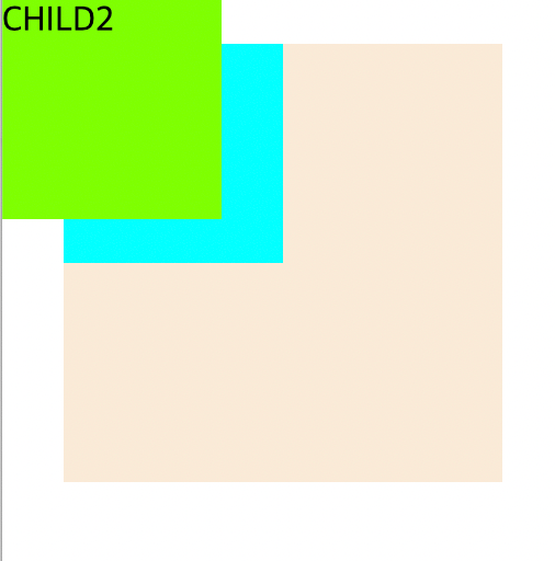
.b {
position: absolute;
top: 0px;
left: 0px;
width: 100px;
height: 100px;
background-color: chartreuse;
}결과
absolute 적용 후 모습 (부모 컨테이너에 relative 요소가 없다면 브라우저, 왼쪽 상단 (0,0) 기준으로 그려진다.)
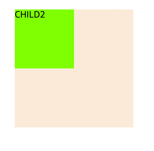
이 때, 부모 컨테이너 aa클래스에 position: relative 값을 적용한다면?
style.css
.aa {
    position: relative;
    width: 200px;
    height: 200px;
    margin: 20px;
    background-color: antiquewhite;
}

.a {
    width: 100px;
    height: 100px;
    background-color: aqua;
}

.b {
    position: absolute;
    top: 0px;
    left: 0px;
    width: 100px;
    height: 100px;
    background-color: chartreuse;
}
결과
부모 컨테이너 기준으로 top: 0, left : 0 위치에 그려지게 된다!
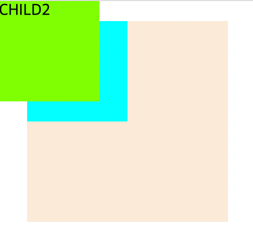
position: fixed
박스에서 벗어나 브라우저 기준으로 위치 변경이 일어난다.
즉, top / left / bottom / right가 브라우저 기준으로 설정된다.
style.css
.aa {
    position: relative;
    width: 200px;
    height: 200px;
    margin: 20px;
    background-color: antiquewhite;
}

.a {
    width: 100px;
    height: 100px;
    background-color: aqua;
}

.b {
    position: fixed;
    top: 0px;
    left: 0px;
    width: 100px;
    height: 100px;
    background-color: chartreuse;
}
결과
fixed로 고정된 요소는 브라우저 스크롤이 움직임과 상관 없이 항상 그 자리에 위치한다.
또한, fixed로 선언된 요소는 다른 요소들과 겹쳐 안보일 수도 있는데, 이 때는 z-index를 활용하여 화면 위로 나올 수 있게 조정한다.
position: sticky
브라우저 기준으로 위치가 정해지는 fixed와 달리, 부모 요소 안에서 현재 자신의 위치에 고정된다.
top / left / bottom / right 값을 지정해야 적용된다.
style.css
.aa {
    width: 200px;
    height: 200px;
    margin: 20px;
    background-color: antiquewhite;
}

.a {
    width: 100px;
    height: 100px;
    background-color: aqua;
}

.b {
    position: sticky;
    left: 100px;
    width: 100px;
    height: 100px;
    background-color: chartreuse;
}
결과
참고 사이트
https://velog.io/@pm1100tm/CSS-position-%EC%86%8D%EC%84%B1-%EC%A0%95%EB%A6%AC